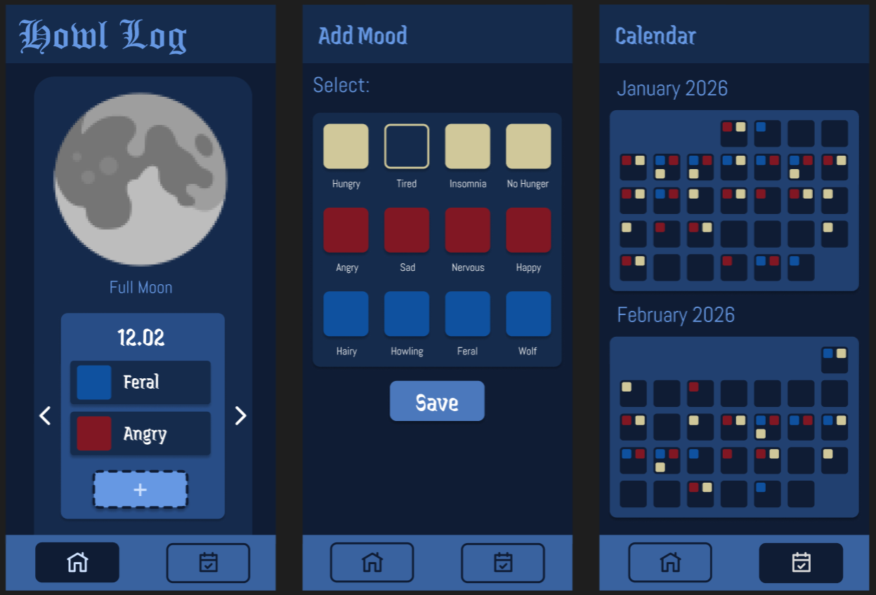
Howl Log is a mood/moon tracking app for werewolves. Track your lycanthropy symptoms throughout the moon cycle and never be surprised by a full moon again.
Repo here: https://git.nwt.fhstp.ac.at/weretracker/ws25-ccl3
Mood, moon & symptom tracking for werewolves.
| ID | Year | Month | Day | Categories | Moods |
|---|---|---|---|---|---|
| Int | Int | Int | Int | String | String |
The main issues I ran into were that the documentation regarding the styling options of each element were insufficient, wrong or sometimes not helpful. A lot of the time it was just a guessing game or just trying different approaches to figure out how something works. For the API I encountered a similar problem, since it only provided documentation for other programming languages.
I did the API integration, the icon design, the layout and styling of the app, fixed bugs in the logic, (and the things Anna didn't want to do xD)
We basically achieved what we wanted for both the features and the styling. We even added a search option to our app which was neither a part of the original plan nor prompted by the user testing, but it was a feature we thought would be useful and nice to have. A thing that could be improved/added would be the feature to click on a day in the calendar that then brings the user to that exact date in the daily overview. But since we have the search now, you can easily go back to any date you want without manually clicking through each day.
The main issues i ran into where 1) figuring out how to manage saving of the current date & date changes for the main view, and then figuring out how i can ensure that after editing/adding an entry on a past date it goes back to that date not the current date, and 2) how to save the selected moods and their related categories into a string to be saved into the database.
I built more or less the basic functional shell for the app (minus the api), so the database, the function for interacting with the database, the not api related functions of the view-models, the completely unstyled base shell for the ui, the navigation and navbar (minus the fact that it looks good) etc. as well as this index file :).
The app does what we wanted it to do which is great :) we added a search function on the main page which wasnt originally planned since going far back in time was tedious. Further improvements could be made by adding navigation from the days in the calendar view to the corresponding main view.
| Description | Heuristic | Severity |
|---|---|---|
| Date switches back to current day after adding/editing in the past | 7 | 2 |
| Lack of visibility of system status (no error messages, missing loading indicators (only moon) etc.) | 1 | 1 |
| No back button for add/edit view; have to leave via nav bar | 3 | 2 |
| No way to undo deleting | 3 | 1 |
| Endless “scroll” to get to desired past/future date, no get back to current date option | 7 | 2 |
| No warning on delete | 5 | 1 |
Based on Nielsen’s Usability Principles
How intuitive is the user flow?
How intuitive are the buttons to use?
Are there any big issues?
Perceived intuitiveness
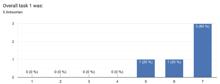
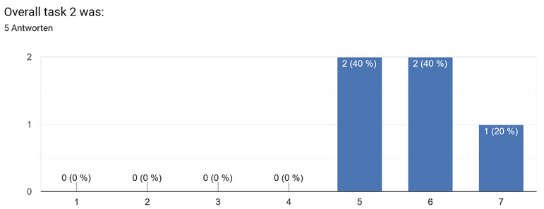
4 predefined Tasks + Questionnaires (SEQ after each task + SUS after all tasks.
Set up the testing environment to ease into the testing phase: Close your eyes (if you want). Imagine you are in the office, and you have sooo much work to do. You are sure that you have to pull an all-nighter. But you remember, you are a werewolf🐺🌕. So you take your phone and pull up your very handy App - HowlLog to check the moon phase, and ensure you won’t run into issues with suddenly transforming.
Number of Test Subjects: 5
Age Range of Test Subjects: 19-36
Average SUS Score: 92
During the usability test of the application “HowlLog”, the system was overall perceived as very intuitive and straightforward. The most crucial points of the received feedback included suggestions for the naming convention of buttons, button size and their visibility.
While observing the users during the testing phase, multiple test subjects tried to tap a day in the calendar overview, some participants even more than once, which resulted in brief confusion, but only one participant noted that it would be nice to have this feature implemented.